outline photography


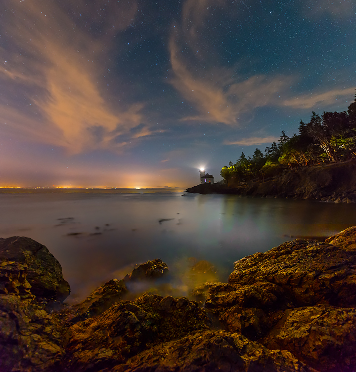


I have done my research on outline photography and explored a few pictures of what outline photography looks like. Outline photography is mainly photo shopping your own ideas, that your outlining the important objects or pacific parts in the image also taking the reflected light, patterns or emitted from images. It kind of links in with silhouette photography.
bill beckley

Bill Beckley is a photographer I have choose to analyse. One he is a very good photographer and has many techniques that he uses in his photos. also has achieved a lot of awards for his hard work, thoughts he bases his work. Bill Kutztown State University, Pennsylvania, B.F.A. Tyler School of Art, Temple University, M.F.A.
The award he has gained;
The award he has gained;
- Pollock-Krasner Grant, 1997
- New York Council of the Arts, 1986
- National Endowment of the Arts, 1979
- New York Council of the Arts, 1976
- New York Council of the Arts, 1973


Personally I really like these pictures, they look interesting they way the have been taken. showing a wide variety of colours to make them look elegant. Bill Beckley have emphasized outlining by setting natural forms against a strongly contrasting and coloured backgrounds followed by another photographer Joan Fontchuberta.
joan fontcuberta

Joan Fontcubereta does the same work linked with Bill Beckley trying out different outlines by natural forms against a strongly contrasting and coloured backgrounds. 'Photography is a tool to negotiate our idea of reality. Thus it is the responsibility of photographers to not contribute with anesthetic images but rather to provide images that shake consciousness.' he says. Is a conceptual artist whose best-known works, such as Fauna and Sputnik, examine the truthfulness of photography. In addition, he is a writer, editor, teacher, and curator.
He worked in advertising in his early career, and his family had also worked in advertising. From 1979 to 1986 he was a professor at the Faculty of Fine Arts of the University of Barcelona, after which he earned a living through his art.
He worked in advertising in his early career, and his family had also worked in advertising. From 1979 to 1986 he was a professor at the Faculty of Fine Arts of the University of Barcelona, after which he earned a living through his art.


shoot


whilst it had been snowing, one thought it would be good to capture the snow on the branch of a tree as it lasts. The photographs i got were not the best, for them to be even better i could of went closer to capture the features of the branch with little bit of snow. I do like them because you can see the outline of the snow also the tree. The picture looks very dim and gloomy which brings out the colour of the snow which makes it more whiter.


original photo

retaken photo

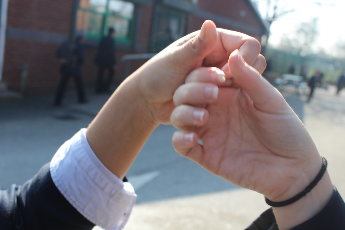
Reflecting to the artist Bill Beckley, one adore this picture and make it too look really good, with the sun beaming in the middle of the love heart brings out a great effect. The main focus is looking at the outline within the love heart shape defines the look of the hands. What makes the hands stand out is because the exposer point is on 5.6 so it then blurs out whats going on in the background.
first shoot


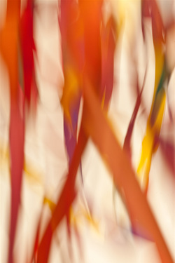
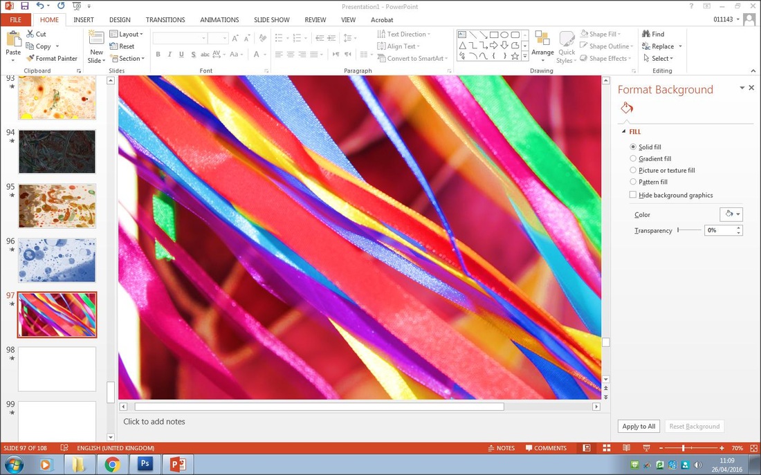
Reflecting on one of the photographers I have chosen one thought of taking some ideas from Bill Beckley’s photographs. My reasons for this I love the style that he uses with his creative thoughts and his imagination, with all the different colours makes the pictures stand out, look pretty and elegant. Bill Beckley mainly mixes colours with each other for example when he done a shoot with all different colour ribbons. The way i have done this shoot is if you use a fan you can take some great pictures because it mixes the colours together in a fast motion .
aRTIST PHOTOGRAPH
my take

I have re implied the Technics that he, the artist Bill Beckley has used, although extra I added a fan to create a blurry effect that should appear after haven taken the photo which it has done. Also what makes the picture attractive is the mix of colours that have blended together. The cameras exposer point was 5.6 so it was at a size not too small or too big, just so you can see the ribbon.
second shoot


best photo
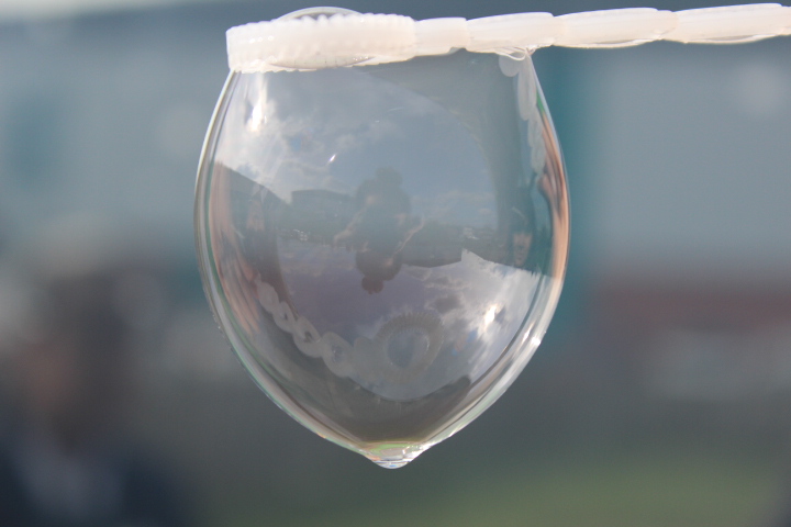
By far this is my favorite photo of them all, the outline stands out very clear also with the reflection of me and Rusha in the bubble looks good as well as showing the outline which i'm focusing on you have reflection in there. One love the fact the focus point is on the bubble and the background is fully blocked out which stands the bubble out more. The camera setting was on exposer 5.6 . Where the bubble has been created you can see the other side of the stick but inside the bubble.
worst photo
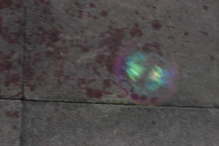
The image is dreadful no focus point at all, it is just pointless as well the paint on the floor ruins the image.


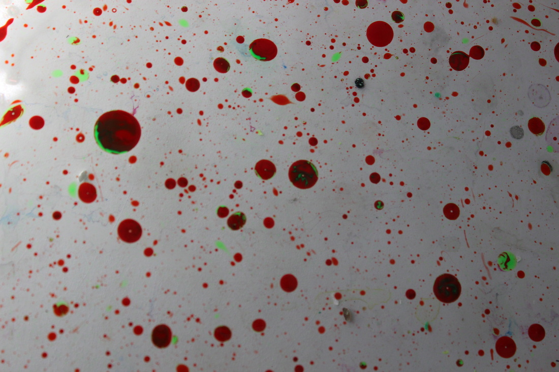
As you can see this shoot is full of bright colours this is only because the light is bringing the colours out more from the chloroplast. All I used was different coloured chloroplast, with this you can make outlines by crunching the paper together to make it crinkle and as you can see where they have been wrapped together you can see the outlines.
best photo
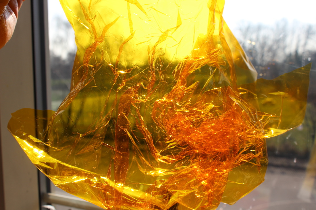
One love the fact that holding it in front of the light it glows up the colour in the chloroplast which makes it sparkle. Aswell the camera lens would just be capturing the parts that stand out this makes the rest have a blur to it for example the background because the background is just not needed in the shoot, all focus is the middle.
worst photo
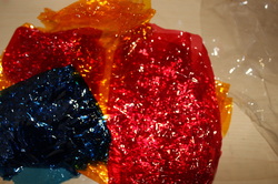
This image is not satisfying enough that there is nothing to it that I like about it. It isn't actually linking to the title I chose which was outline, therefore it is pointless.


shoot 1


shoot 2


shoot 3


FINAL PIECE


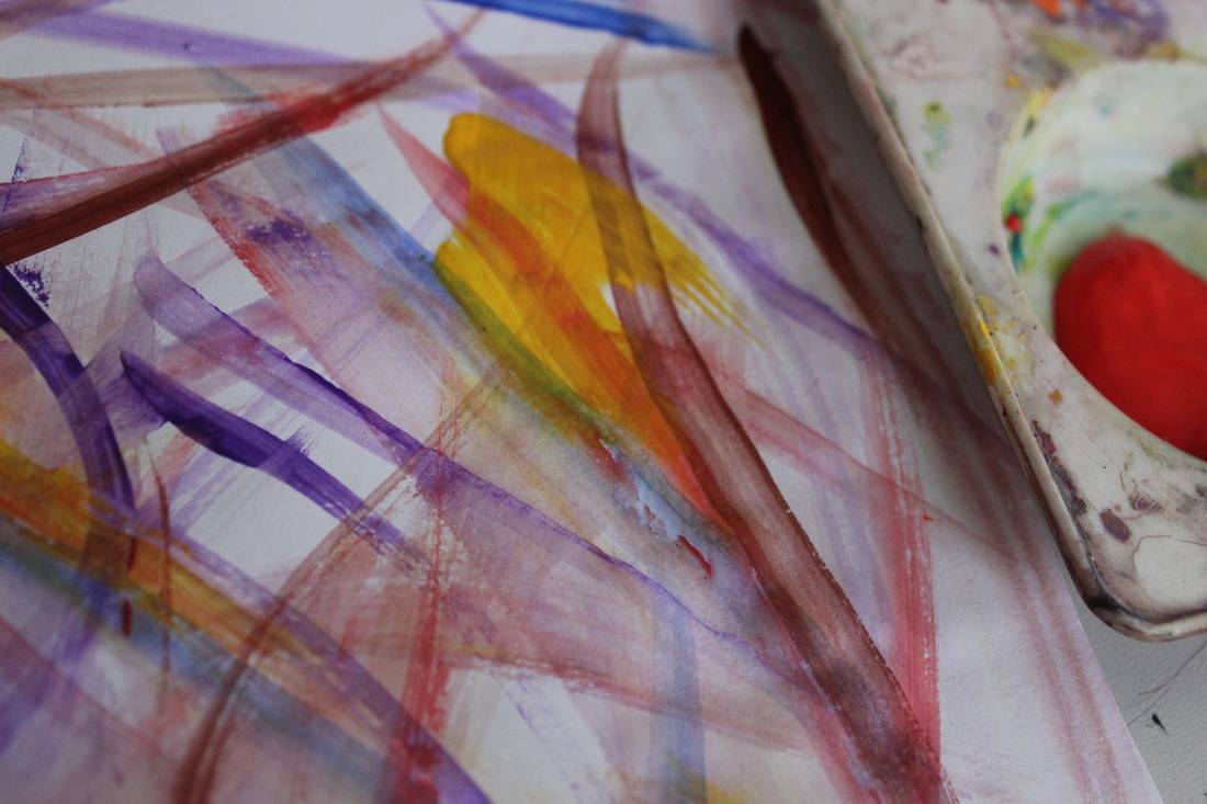
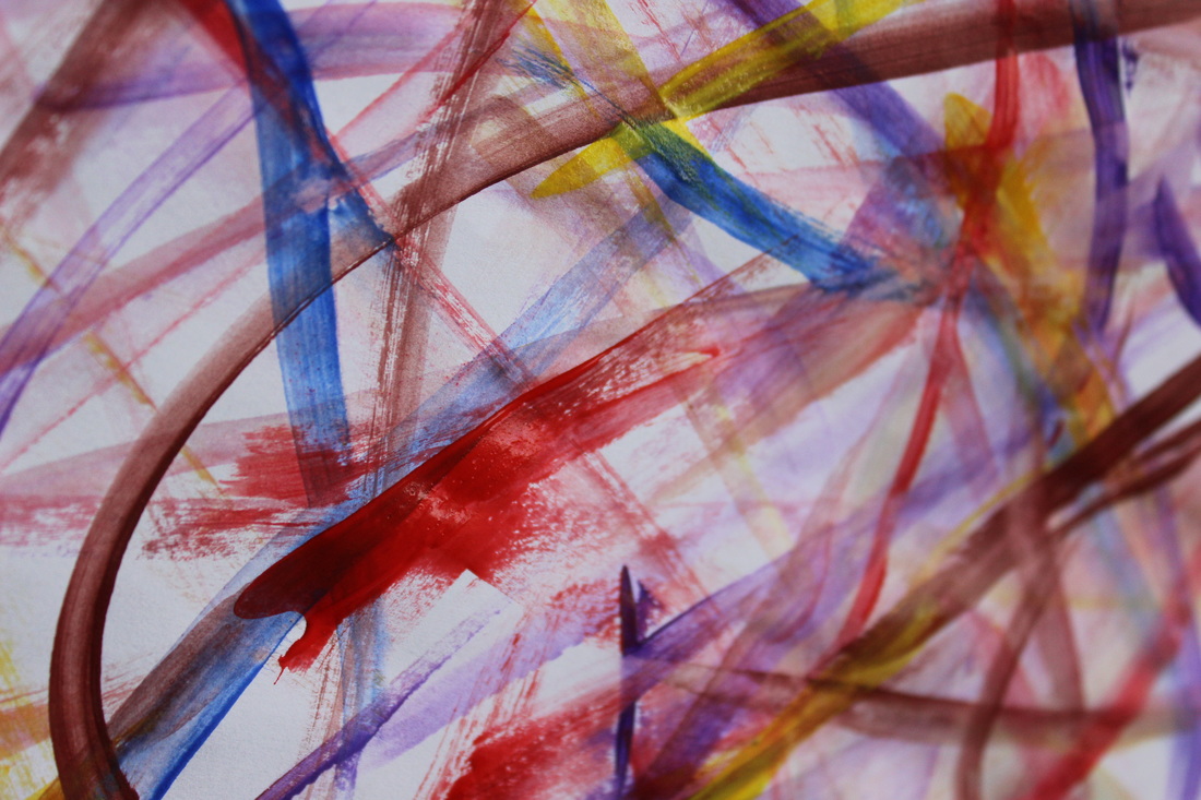
My final piece I have done a transation of all my photographs linked with outlines, one thought what I'm doing goes well with the photographer I have particularly chosen 'Bill Beckley'. His photos are amazing so I had in mind to do some some similar photographs linked with his images. For my shoot, I gathered aload of different coloured ribbon and took lots and lots of pictures but in my own way, all the colours blend really well together and the bright colours make the outline of the ribbon stand out and make it look very eye catching. The shoot that strongly caught my eye was the ink colours mixed in the water were great, fine and elegant.
My two edited photos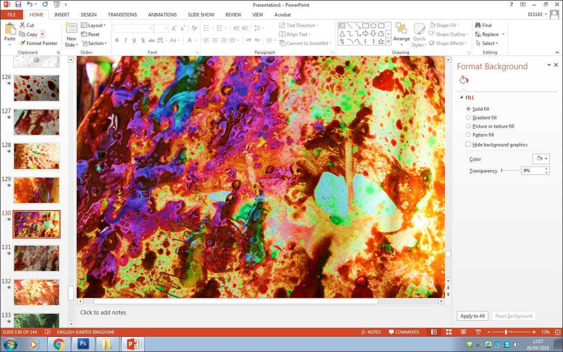
Here are my two edited photographs, The reason I have chosen these ones is because I love the colours they make the picture look outstanding and bright with lots of colourful imagery. First image you can see the outline of where the paint blends in the other colours, also you can see a few bubbles. What I done is got the ink colours and dotted them all over the water, then got a paint brush to stir the paint in with each other. After, picked up a piece of blank A4 paper and gently placed it on top of the water. It then shown these beautiful colours on to the paper with a few bubbles. I then edited it on power point to stand out the colours more. It looks much better with neon colours.
|
My second best photograph, I chose a variety of colours and sectioned them so they weren't tangled, haven done that i placed a fan on the desk top. One having a fan blowing the ribbon around would bring the colours out and cn see the outline of them all. I then edited the picture on powerpoint.
|


