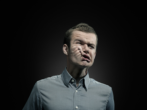
The reason i have chose this photo is because it is strong and powerful photograph. The colours the photographer has used is to make it look affective, black background makes it more grim, they have also placed the light right above and faced looking down on the person to stand out. His emotion that he is showing on the picture is telling you that men can also suffer domestic violence as well as women. I really like the picture, it shows a clear message of what it is showing you, the look of pain on his face making you think of loads of thoughts about what people get treated like. Punch mark left on his cheek has been Photoshop so you can properly see what that person has left onto his face and the after affects it is going to leave from the punch. Where they have captured the image it looks like it has been took in a studio, from the spot like. They have cropped it from the chest just to show the main features and clothing, he is wearing a blue shirt with the top button undone to that he cant breath properly so that's why he has done it.
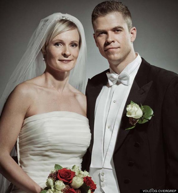
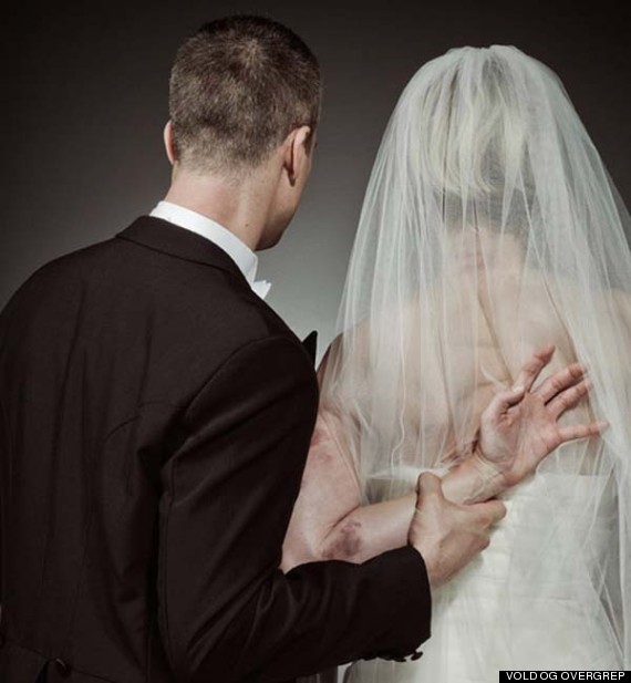
You can see a couple that are getting married, behind their smiles, white beautiful flowers and white gown. But really their not real smiles their just showing their happy. From behind her husband has got his wife's arm wrapped around his little finger, you can see how tight he has got his hand on her arm. The photograph has been taken in a studio because how the lighting is on the couple and black background to make it look dark and gloomy. The bruises what are showing on her arm look bad, seems like she is controlled by her husband but she doesn't want to leave him because she is scared but also she loves him, that's what the story line seems as though it is telling you. Relationships may look normal but abuse can hide anywhere...
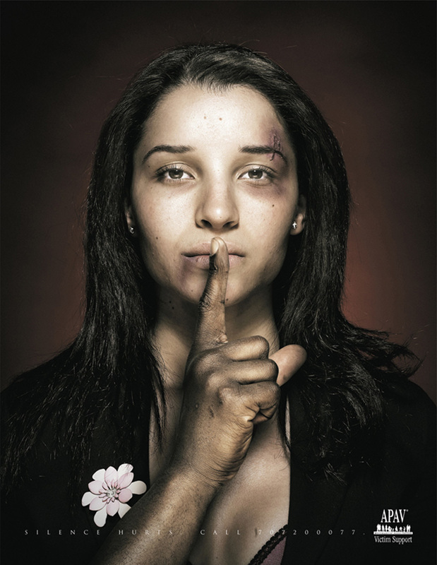
I find this a very powerful photograph, shows the mans finger on her lips to keep her quiet and don't tell anybody anything, not letting her to speak and knows that its hurting her inside. The way the picture has been set makes it look eye-catching, with the shading and the dark colours. 'silence hurts' inspirational quote about love, but also about her loved one hurting her. If a couple fights say mean things to on an other they say them out of anger, to hurt the person cause they got hurt. Always two sides to the story. Mean words hurt and asking forgiveness doesn't make it ok, but when the heart breaks emotions can be unpredictable. That's heart break, but keeping someone's things and money is an act you can control and can not be justified cause your mad. If a couple fights say mean things to one another they say them out of anger, to hurt the person cause they got hurt. Always two sides to the story.
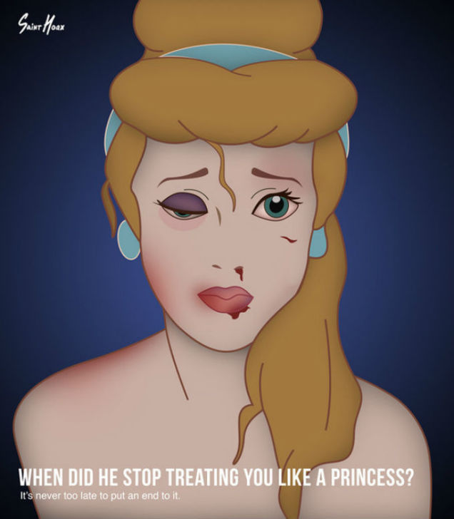
This image is a very horrifying and unsettling image, targeted at women suffering domestic abuse from there other half. I find this picture shocking and heartbreaking image to look at . You can see the that they have edited this Disney princess character and captioned it as 'when did he stop treating you like a princess'. more treated like a toy, like being thrown around with. the tears building up in her eyes, the nose bleeding from a punch in the face as well as scratch mark. The photography has deemed the edges darker to make it look more effective. As you think about this picture, it is powerful as you look more into it.
Donna Ferrato
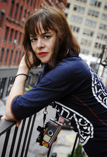
Donna Ferrate is an internationally acclaimed photojournalist known for her ground-breaking documentation of the hidden world of domestic violence. Ferrate launched the "I am unbeatable" campaign to expose, document, and prevent domestic violence against women and children through real stories of really people. She has worked for almost every major news publication in the country, her photographs have appeared in nearly five hundred solo exhibitions in museums and galleries worldwide.
Plan
I want to create an image to symbolise domestic violence. My model will have a bruise around her eye, I will add text to help put my message across using photoshop. These are the things I will need for my shoot....
- Dark area- school toilet/ inspiration room
- Iphone flash light to create a spotlight
- girl for model
- dark background
- makeup bruising
- f.16
- exposer just under normal
- focus point on her face
first shoot
My FAVORITE 2 photos |
|


|
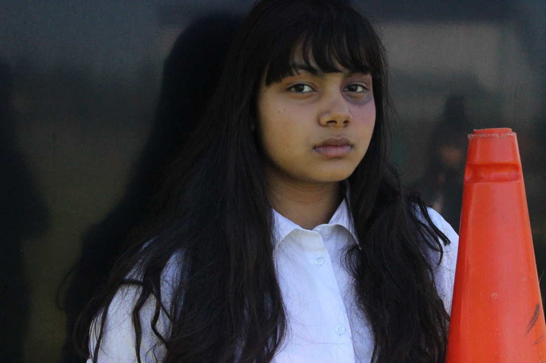
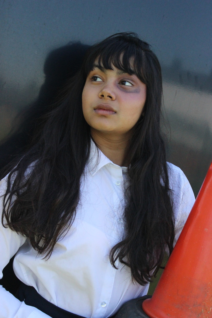
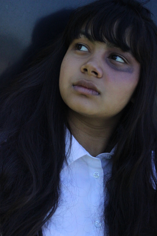
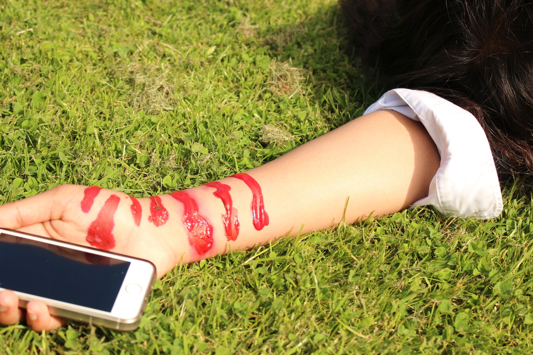
Out of the whole first shoot, these two images catch my eye the most. They both stand out and show a clear message. I have taken this shoot outside but have took with a black BACKGROUND, wanted it to look powerful WITH the black boarder with the light brightening up the photo, It kind of sinks in with the bruise, shows the colours. like the fact her shadow it reflecting in the background, also the way she looks. You can see the hurt on her face, the way shes looking up make you think what the person was thinking. The second images with the orange cone tried to make a message saying stop domestic violence. To me i think it is a strong picture. I think with the cone being there, it makes the people catch the ATTENTION from the bright colour. which i think you can think deeper about this image, why there would be a cone placed in her hands. The only problem is that the background picture 2 is you can see whats going on in the back ground, so even better if there was just black background. the focus point is aiming at rusha and the orange/red cone. I really like the exposure that has been done on the 1st images, looks more gloomy and shows out the bruise.
|
worst picture

I feel that this is my worst photo out of all because the exposer is to bright and doesn't match the theme. The main reason why is because Rusha is laughing, she is meant to show sadness ,hurt. Also you can see the reflection from the things in front of her on to green backgrounds. This is image would not come across as powerful. Focus point has not been used, as I was taking this photo the camera moved so it made a blur.
second shoot


To be honest in my opinion, I think most of these pictures are bad apart from 1 or 2, there hasn't been any black out parts in the images and I think with it have been broad daylight is that it doesn't look imaginative, it just looks effective. The exposure wasn't in the correct place so that is why it looks bright. With Rusha moving in these images, the photo doesn't look how it was meant to be planned out which kind of puts off the whole idea of what I wanted them to look like. It would be even better if the 'blood' doesnt look realistic which puts off the whole shoot, I will have to retake the shoot, to work on making fake blood.
WORST photo
From looking through all my pictures I agree that this is one of my worst picture of capturing this shot. Exposer is to bright so it doesn't match the image. Focus point has not been used, it doesn't show a story behind the picture. This image would look more effective if it was edited to make it more gloomy, in my opinion it would bring out an effect. I have chosen a wrong place to capture this shot because the grass looks alumnus so it kind of cuts out of what the picture is meant to look like. When you look at this image you don't feel any emotion. On the other hand is that on the arm it is meant to look like blood but I have used red paint as you can tell so it wrecks the photo because it doesn't look real. Also the focus point isn't took in a specific place, I just think there is not enough detail to have a good look at.
BEST picture

This photo is unusual but it is also my favorite. The focus point is where it was meant to be on the phone mainly and partly on the arm. The main point is how I have tried to use red/brown paint on the arm to make it look like fake blood, can also look quite real. Story line is showing you that their are secrets to be revealed but by an unknown number. I quite like the effect that has given it to look realistic, from a few drops of water it shows that it has just happened. Looks more imaginative with the phone being their in the palm of the hand, text messages coming through to her phone by an unknown number which seems more curious as in making you think deeply into this situation. What also looks good is the time on the phone 10:10 looks more intrusive also is unusual to have both of the same number in time. To make it look very more interesting it could of been taken in a pitch black area, then have a flashlight spot on the cuts and have focus on the text massages, blur out a few of the cuts. It would look more grimmer also imaginative with the thoughts that have been put into this shoot.
Things i have changed to improve:
- instead of fake blood, i have used paint to create a bruise to make it look effective.
- taken these pictures in a shadier place to make the image more gloomier.
- used a quote to link in with my idea
PREPARATION


pictures


worst photo
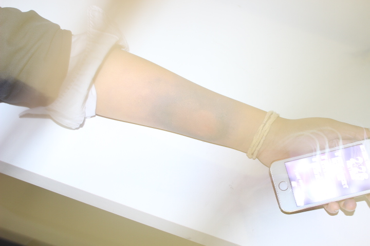
Looking at this picture you can see it is my worst out of all my photographs. The exposure is way to high by messing with the camera settingswhich makes the whole picture bright white. Also the camera moved so it looks shaky and blurry, in other words makes the picture look dull and weak.
best picture
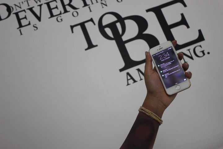
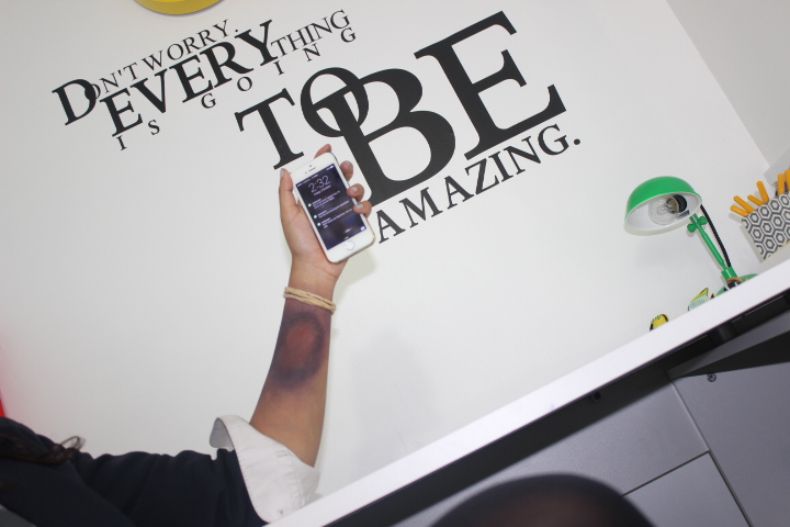
Out of all my photos personally I find that this image caught my eye the most, the writing brings out the photo and links in with my idea. I think with the quote being their it makes it look effective because it is big and bold. You can tell the camera has zoomed in the lens so it cuts out the not necessary part of the picture. As well as having titled the camera to fit in the text on a angle which really looks very good. What would be even better if the camera has a focus point on the phone so you can see the text messages clearly, and blur out the background. Also thought about if haven chosen this topic because to me really thought it would be a good topic to do. The image shows that someone has been bullied looking at the bruise on the arm as well as somebody sending horrible text messages, this is why I thought it is strong because it is referring to the quote 'Don't worry, Everything is going To Be Amazing'. I like the fact some parts of the sentence is bigger the make it stand out and you don't have to worry everything is going to get better.
THIRD SHOOT
I have thought about basing this shoot on bullying campaign to show that is it wrong. It needs to stop! The scene is going to be in a dark place with 1 person bullying another person and then somebody with their hand up symbolizing that bullying needs to be banned/stopped. That everybody needs to be fair to one another, with respect. 'Don't judge a book by its cover'.
- f16
- dark background to show a strong view of whats going on
- focus point on hand for text
- exposer just under average
- lightening to lighten some parts of the picture
- dark room to show the emotions of how that person feels
Bullying


The whole shot is about a student been bullied by another student. This image is very strong I think because of the angle, plus the area it has been taken in, the toilets is the best place to do a bullying shoot therefore it is a dark place to be and also not a nice place to be.
worst picture
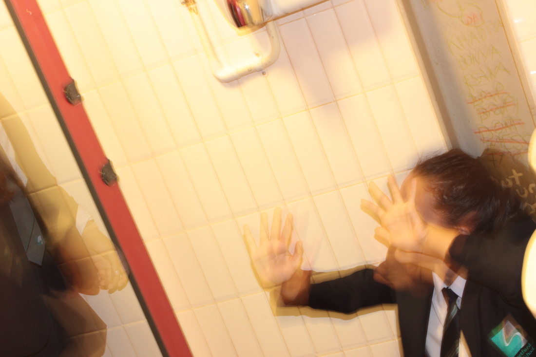
The reason I have chosen this picture as my worst is that it is out focused, but in a way I quite like it because it looks fuzzy. The focus point hasn't been used to show the main detail. The exposer was set on average, because the photo looks shady. I like the fact Chloe's hair looks invisible, that you can see the graphite through her hair, makes it look effective. The camera shuck so the picture came out messy.
best picture
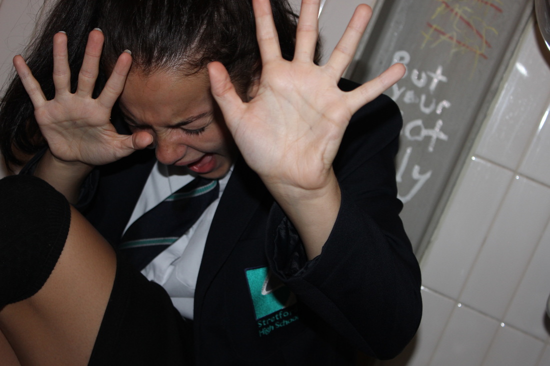
I thought looking through my pictures, this picture had stood out because it is a very strong image. It shows facial expressions to show how they are feeling. The reason why i had took it in the girls toilet is because it is a dark place to be. It would be better if i written a message on the wall as graphite. As you can see that Chloe's hands are up to symbolize bullying that it should be band. The graphite on the wall is linking to the picture, being called names and the quote is "But your not ugly". In my own opinion i find image powerful, it makes you think of how others feel and what thoughts are going round in your head, makes you think. The facial expressions make it look strong brings out how the person is feeling.
